Lot’s of thought went into the logo for my campaign. I wanted something to stick out but what could in a sea of other signs that typically look the same? I wanted something that represented our town, that residents could immediately identify with. But how? I lack artistic skills but having designed my company’s initial logo in Microsoft Paint almost a decade ago, I have the creativity part there. I sat down with an employee of mine and we got to work.
Here are the multiple revisions and reasoning behind our final campaign logo:
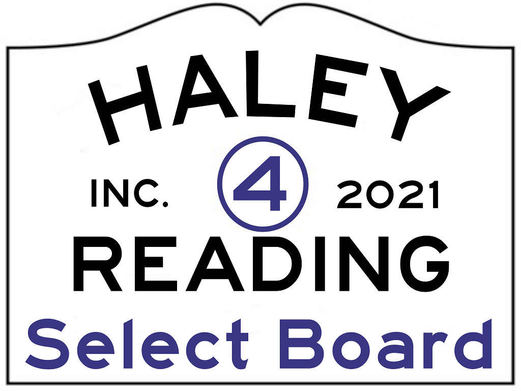
The initial idea was to make it look like the Entering Town signs we see everywhere. I used the same color scheme, font and layout of the existing signs minus the yellow.
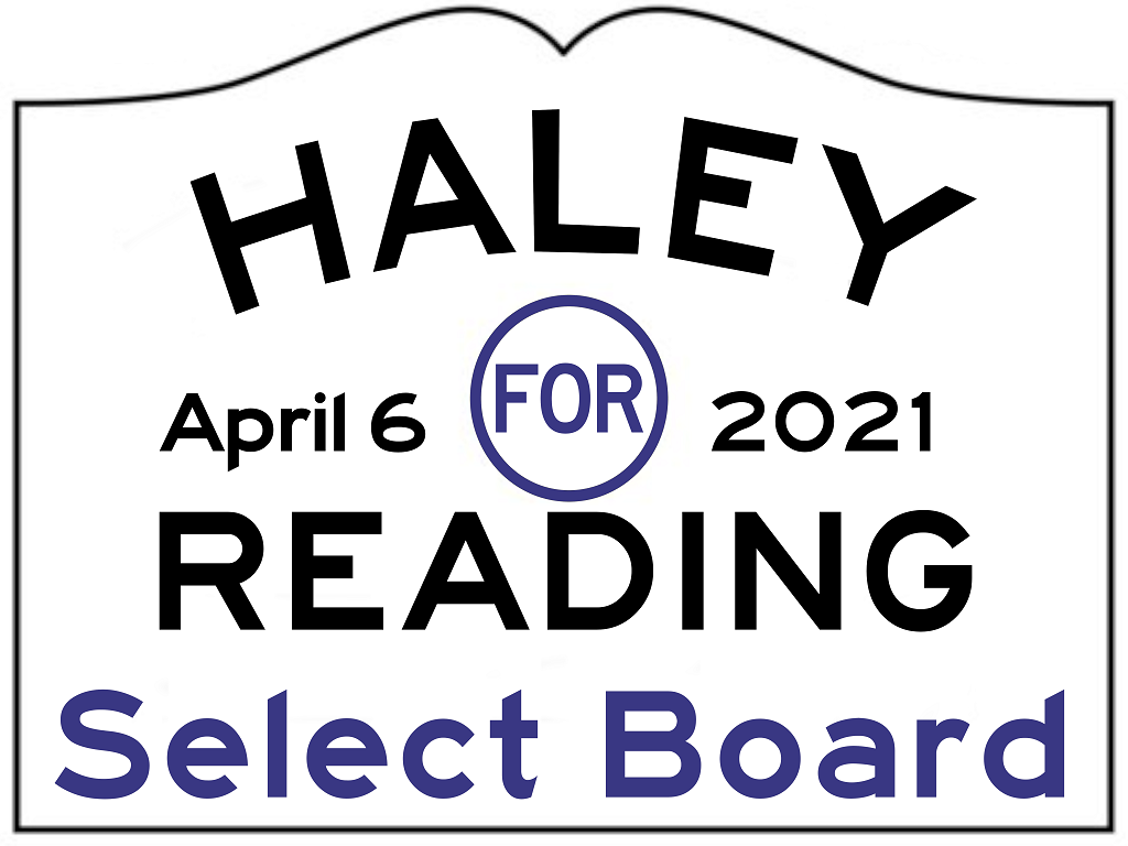
The initial 4 in the middle reminded me too much of the Fantastic Four comics and changing it to spell the word out, allowed me to introduce the election date.
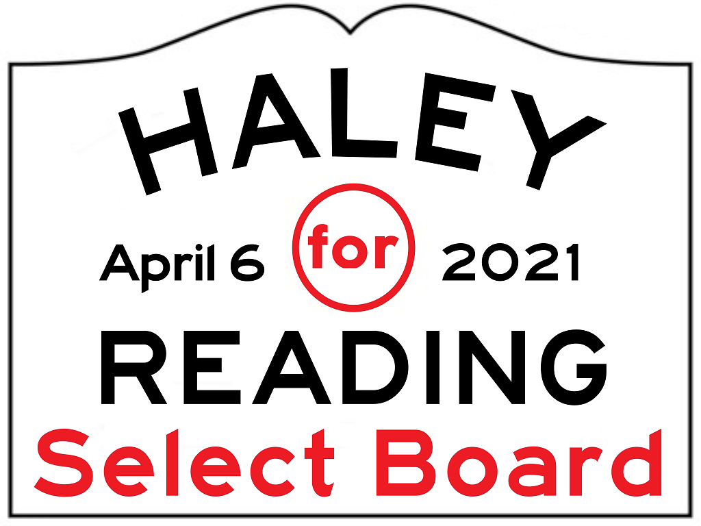
This revision had the word “for” changed to lowercase and introduced a default red to the mix.
For this copy, we changed it to the “Reading Red” color.
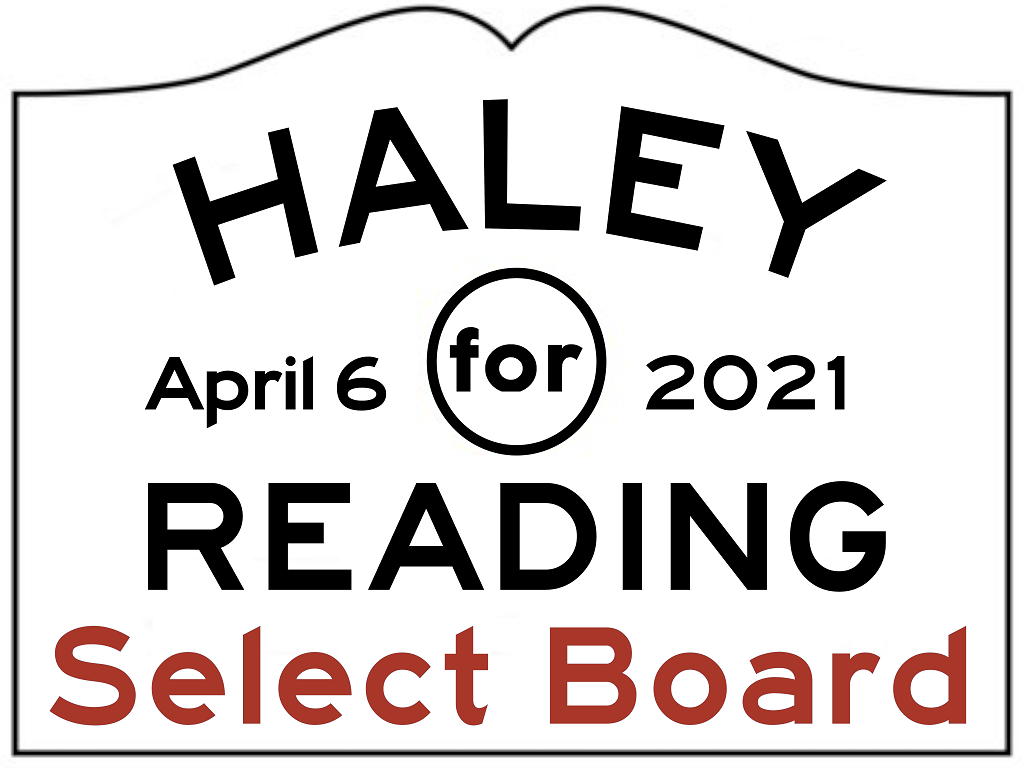
This is when I thought I had done it. Having the border also changed to Reading Red.

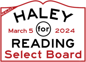
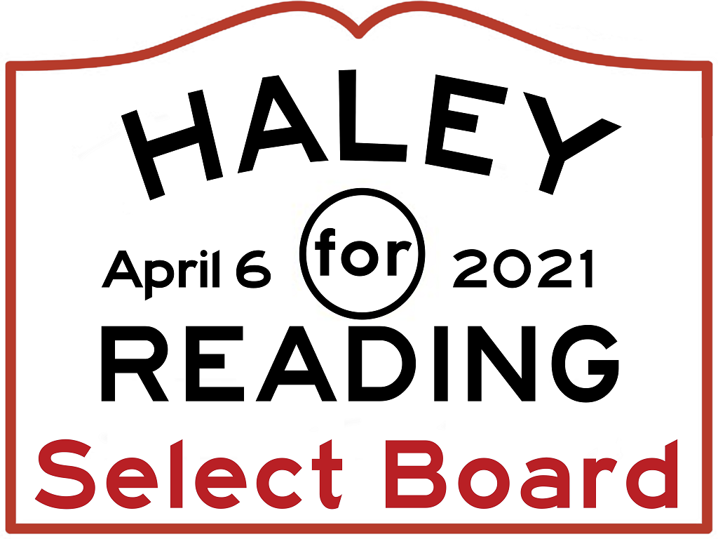
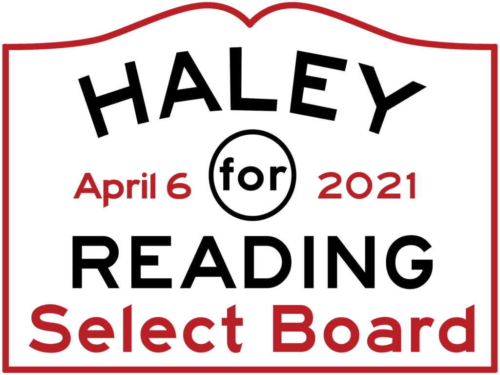
While I was getting my 50+ signatures, I showed my final logo to a local Reading resident/friend/business owner. She liked it but why didn’t I have the date in red as well? Her feedback is why the final logo looks the way it does today. I printed a copy to see how it would look before we had one officially made.
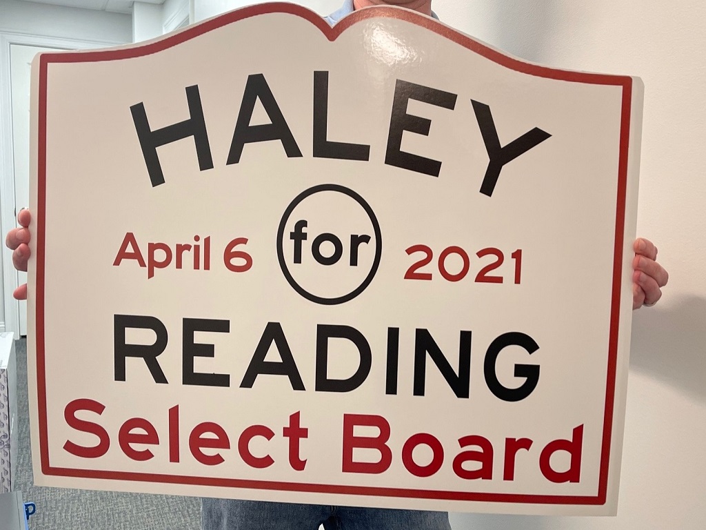
Having the top portion cut out on signs makes a night and day difference in looks as well. The final copy, being produced next week, has all of the lettering centered a bit better. This was just a one off test we had made.
I feel the end result accomplishes everything I thought it would. Hopefully you found this story interesting and you got to see my thought process along the way. It’s just a sign after all, isn’t it? Not this time around… It’s Reading.